Tiếng Việt
Technical Support
FactoryTalk Optix: The Containers Concept
Summary
FactoryTalk Optix: The Containers Concept
Environment
FactoryTalk Optix
Answer
1. Description of containers
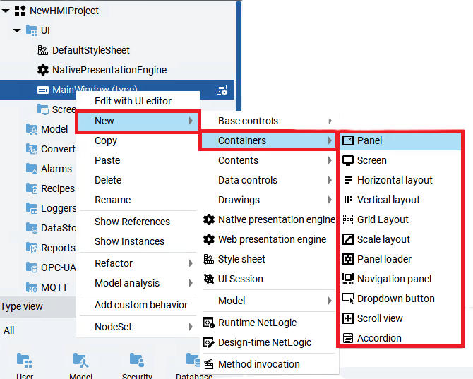
Containers concept helps to create user interfaces. FactoryTalk Optix Studio has many types of containers available. To access containers, right click MainWindow --> New --> Containers, the list of available containers will appear. The following table below describes the types of containers.
| Container | Description |
|---|---|
| Panel | Container for objects that constitute a specific widget. By default, each new panel has a fixed width and height and is aligned with the top-left corner of the parent object. |
| Screen | Container for objects that constitute a specific interface. By default, each new screen stretches to cover the entire parent object. |
| Horizontal layout | Containers can be used to organize objects in a row or a column. These objects can be any UI control or even other containers. |
| Vertical layout | |
| Grid layout | Container that arranges objects in a grid. |
| Scale layout | This container automatically resizes the elements it contains. |
| Panel loader | This container is used to dynamically load different screens into the same place or containers. |
| Navigation panel | This is a predefined panel to create tab-based navigation. |
| Dropdown button | Button that opens and closes a panel when selected. |
| Scroll view | This container is used if you have content which may be bigger than the size of your display. The scroll view container supports multi-touch gestures like zoom in or zoom out. |
| Accordion | Use this object to expand or collapse content blocks at runtime. |
2. Adding Vertical layout, Panel and Panel loader containers
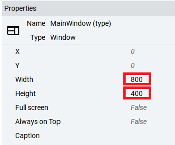
Size of MainWindow is a default size of the project. In order to change the size, click MainWindow, navigate to Properties window. Then you can change the Width and Height value.
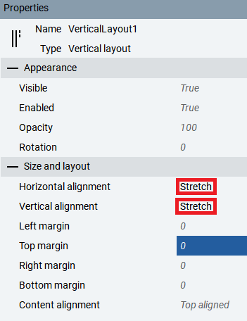
To adapt position of newly added elements to the parent element, you can use Vertical layout or Horizontal layout container, depending on which vertical or horizontal axis the alignment is to be performed. Right click MainWindow --> New --> Containers --> Vertical layout. The Vertical layout container will appear under MainWindow. In order to configure the Vertical layout container, navigate to Properties window of Vertical layout container. Select Stretch to the Horizontal and Vertical alignment as highlighted below. Panel will now adapt automatically to the main window size.
To better organize a project, add Panel and Panel Loader containers. In order to do that, right click VericalLayout1 --> New --> Containers --> Panel. In the corresponding way add Panel loader container. Both containers will appear under VerticalLayout1 container. Select Properties of the Panel1 and PanelLoader1 containers accordingly to the properties window presented on the pictures below. Panel1 container will be displayed on the top bar of MainWindow but PanelLoader1 container will be displayed on all available space, independent from the Panel1 container. To distinguish both containers add Buttons object to the Panel1 container. Right click Panel1 --> New --> Base controls --> Button. Buttons object will be used in future steps. The Project view and Properties of both containers should look as shown below.
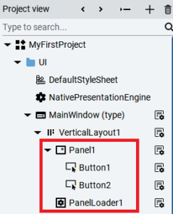
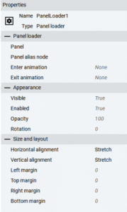
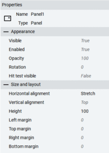
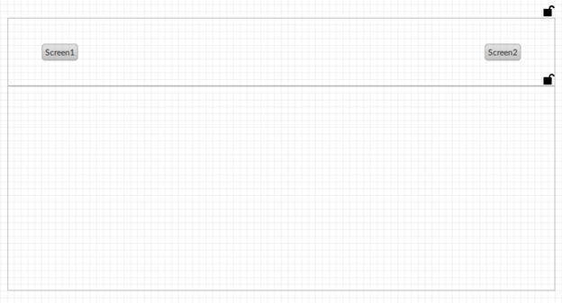
The order in which containers are added under VericalLayout1 object, reflects the actual layout on the screen.
3. Adding folder
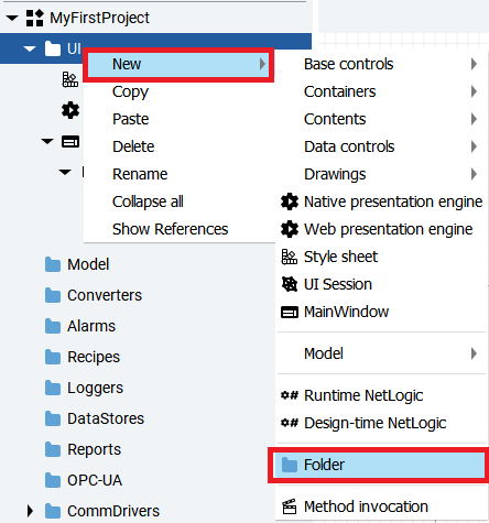
In order to add screens which will be loaded into PanelLoader1 container, create a new folder where panels will be organized. Select the context menu of the UI --> New --> Folder.
4. Adding new screen
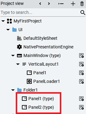
In order to create a new panel in the project, right click Folder1 --> New --> Containers --> Panel. Panel1 container will appear under Folder1 object. Panel1 is going to have the same size as Panel loader container, it must have corresponding Properties window as the PanelLoader1 container. Now you can add to the project second panel analogically to the process of configuring Panel1. Panel2 will appear under Folder1 object.
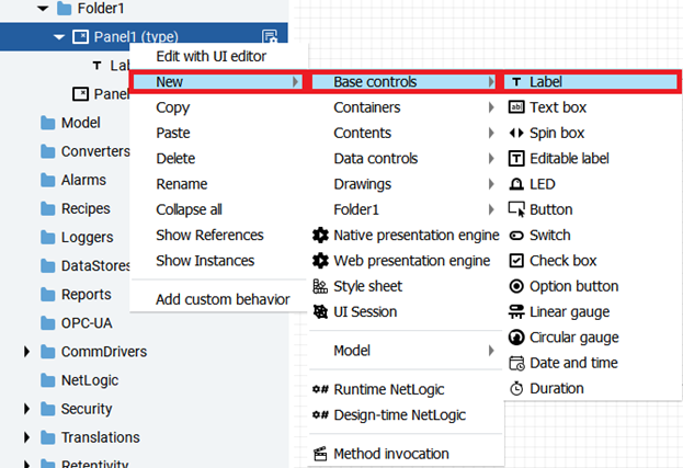
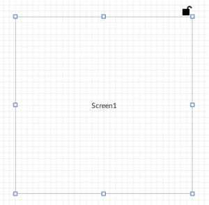
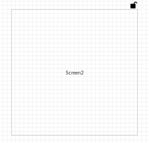
To distinguish both panels, add labels to see when each panel is loaded. Right click Panel1 under Folder1 object, select New --> Base controls --> Label.
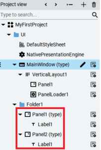
In the Properties window of Label1 object, change text field to Screen1. Configure Horizontal and Vertical alignment to Center so that the position of the Label1 object is centered. In the corresponding way add Label2 object to the Panel2. Change text field to Screen2. The Project view should looks as shown below.
5. Configuration of navigation button
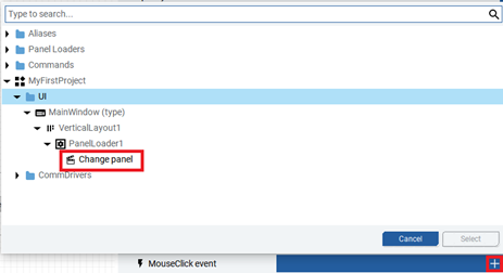
Previously created Buttons objects will be used to control which screen is going to be displayed on PanelLoader1 container at runtime. Double click Button1, navigate to Properties window and expand MouseClick event. In order to display a Panel at runtime, expand PanelLoader1 which is under VerticalLayout1 object and select Change panel.
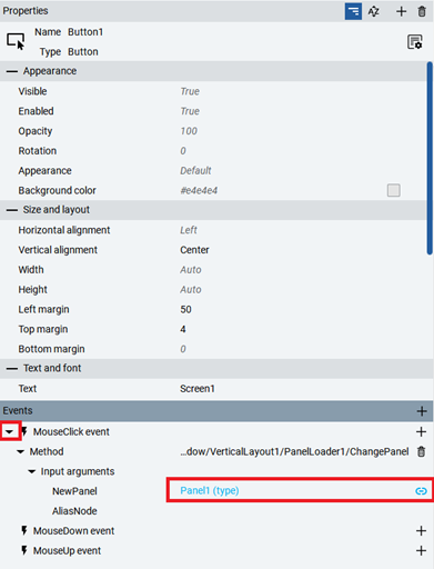
Properties window should look as shown below. In the input argument field click the dynamic link for NewPanel highlighted below. Expand Folder1 object and select Panel1 which will be loaded. Corresponding procedure proceed to Button2 object to display Panel2 container.
7. Testing project
Click emulation button to test project.


The runtime application is presented below.
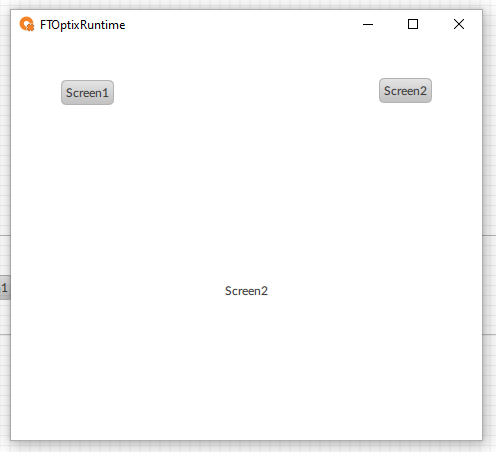
Note: A video version of this answer can be found at this link FactoryTalk® Optix™ Getting Started – The Containers Concept
Source: Rockwell Automation’s Technote database.